CAFA
CAFA
CAFA
CAFA
Design: Branding | Graphics
Design: Branding | Graphics
Design: Branding | Graphics
Design: Branding | Graphics
When the Canadian Arts and Fashion Awards team first came together to establish their inaugural annual gala and yearly events, they approached us to design the brand and logo. We wanted to create something that would be both fashion-forward and stand the test of time but also have a prominent Canadian feel.
When the Canadian Arts and Fashion Awards team first came together to establish their inaugural annual gala and yearly events, they approached us to design the brand and logo. We wanted to create something that would be both fashion-forward and stand the test of time but also have a prominent Canadian feel.
When the Canadian Arts and Fashion Awards team first came together to establish their inaugural annual gala and yearly events, they approached us to design the brand and logo. We wanted to create something that would be both fashion-forward and stand the test of time but also have a prominent Canadian feel.
When the Canadian Arts and Fashion Awards team first came together to establish their inaugural annual gala and yearly events, they approached us to design the brand and logo. We wanted to create something that would be both fashion-forward and stand the test of time but also have a prominent Canadian feel.
When the Canadian Arts and Fashion Awards team first came together to establish their inaugural annual gala and yearly events, they approached us to design the brand and logo. We wanted to create something that would be both fashion-forward and stand the test of time but also have a prominent Canadian feel.
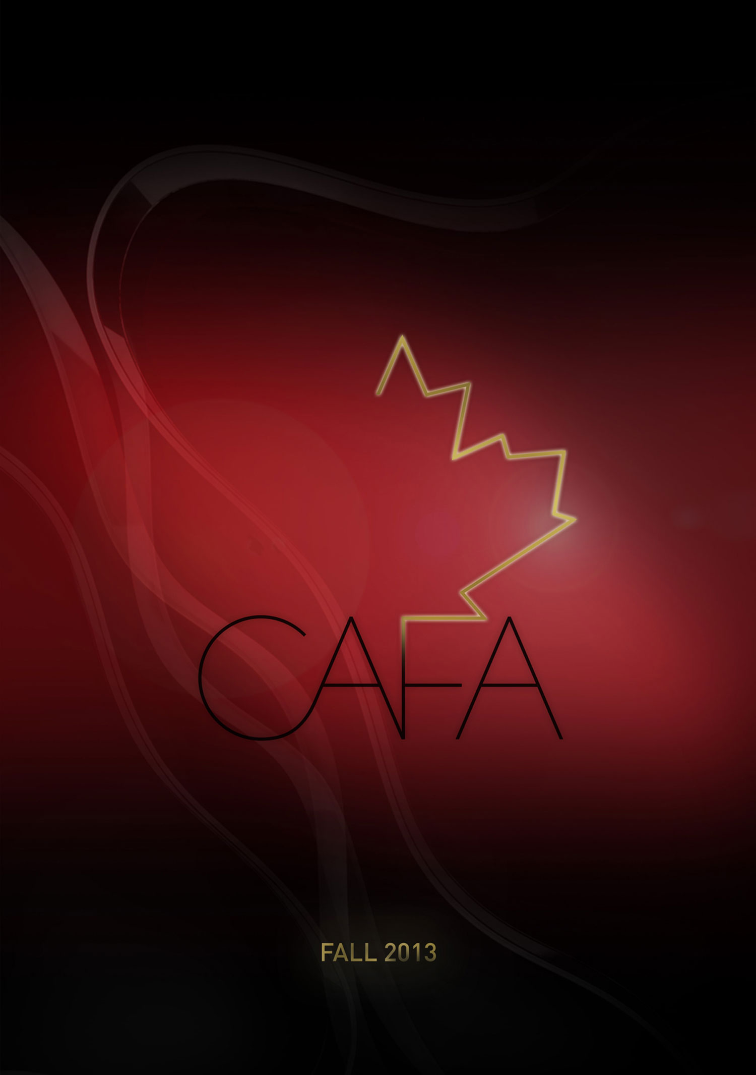
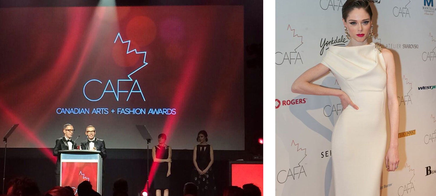
We settled on a stylized version of the iconic maple leaf with strong yet simple font and a classic palette of red, black and gold for a logo that would be easily recognized and translate well to the large screen during Awards galas, as well as across all other formats.
We settled on a stylized version of the iconic maple leaf with strong yet simple font and a classic palette of red, black and gold for a logo that would be easily recognized and translate well to the large screen during Awards galas, as well as across all other formats.
We settled on a stylized version of the iconic maple leaf with strong yet simple font and a classic palette of red, black and gold for a logo that would be easily recognized and translate well to the large screen during Awards galas, as well as across all other formats.
We settled on a stylized version of the iconic maple leaf with strong yet simple font and a classic palette of red, black and gold for a logo that would be easily recognized and translate well to the large screen during Awards galas, as well as across all other formats.
We settled on a stylized version of the iconic maple leaf with strong yet simple font and a classic palette of red, black and gold for a logo that would be easily recognized and translate well to the large screen during Awards galas, as well as across all other formats.
1238 Queen St. East | Unit H | Toronto | ON | M4L 1C3 | 647 344 1144 Email Us
1238 Queen St E | Unit H | Toronto | ON | M4L 1C3 | 647 344 1144 Email Us
1238 Queen St E | Unit H | Toronto | ON | M4L 1C3 | 647 344 1144 Email Us
1238 Queen St E | Unit H | Toronto | ON | M4L 1C3 | 647 344 1144 Email Us


