Premier Infinity Booth | IDS17
Premier Infinity Booth | IDS17
Premier Infinity Booth | IDS17
Premier Infinity Booth | IDS17
Premier Infinity Booth IDS17
Design: Space | Graphics
Design: Space | Graphics
Design: Space | Graphics
Design: Space | Graphics
When Canadian Tire was preparing to make their debut appearance at The Interior Design Show (IDS), they enlisted us to create an experiential booth to showcase their Premier Infinity paint brand. It was important for the booth to strike a chord with both design professionals and design savvy consumers.
When Canadian Tire was preparing to make their debut appearance at The Interior Design Show (IDS), they enlisted us to create an experiential booth to showcase their Premier Infinity paint brand. It was important for the booth to strike a chord with both design professionals and design savvy consumers.
When Canadian Tire was preparing to make their debut appearance at The Interior Design Show (IDS), they enlisted us to create an experiential booth to showcase their Premier Infinity paint brand. It was important for the booth to strike a chord with both design professionals and design savvy consumers.
When Canadian Tire was preparing to make their debut appearance at The Interior Design Show (IDS), they enlisted us to create an experiential booth to showcase their Premier Infinity paint brand. It was important for the booth to strike a chord with both design professionals and design savvy consumers.
When Canadian Tire was preparing to make their debut appearance at The Interior Design Show (IDS), they enlisted us to create an experiential booth to showcase their Premier Infinity paint brand. It was important for the booth to strike a chord with both design professionals and design savvy consumers.
We wanted to create something that would firmly establish their presence in a bold and unexpected way while connecting Canadian Tire to the design community. Our concept was to design a unique interactive experience that would literally put the product into the hands of visitors in our space.
We wanted to create something that would firmly establish their presence in a bold and unexpected way while connecting Canadian Tire to the design community. Our concept was to design a unique interactive experience that would literally put the product into the hands of visitors in our space.
We wanted to create something that would firmly establish their presence in a bold and unexpected way while connecting Canadian Tire to the design community. Our concept was to design a unique interactive experience that would literally put the product into the hands of visitors in our space.
We wanted to create something that would firmly establish their presence in a bold and unexpected way while connecting Canadian Tire to the design community. Our concept was to design a unique interactive experience that would literally put the product into the hands of visitors in our space.
We wanted to create something that would firmly establish their presence in a bold and unexpected way while connecting Canadian Tire to the design community. Our concept was to design a unique interactive experience that would literally put the product into the hands of visitors in our space.
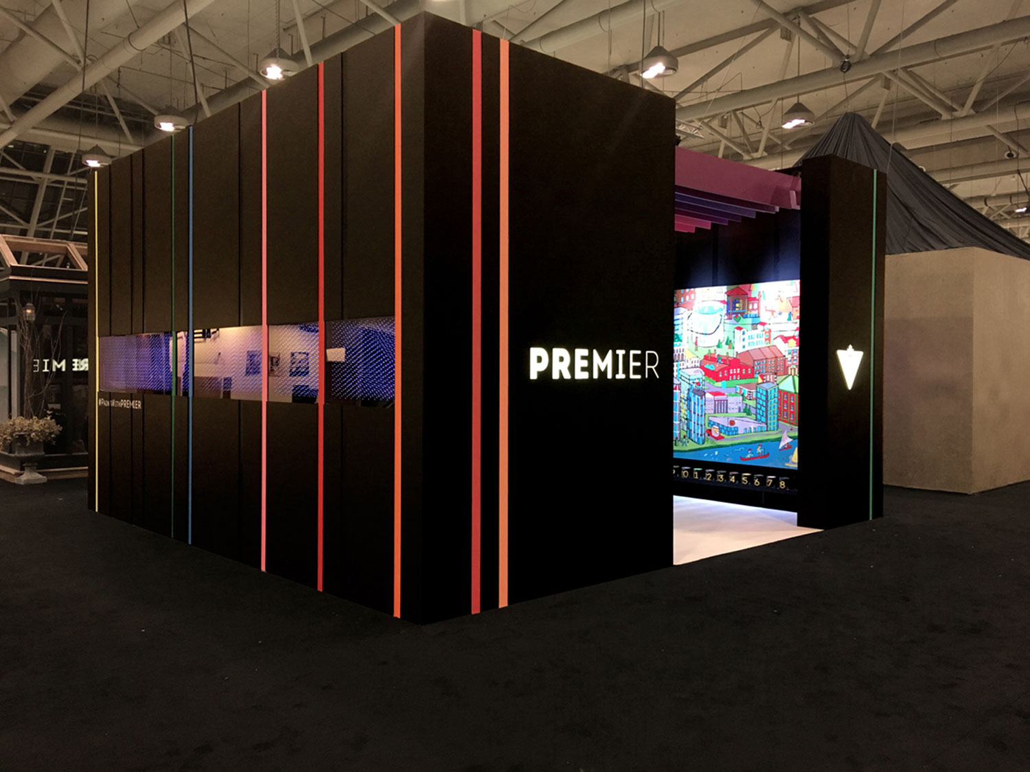
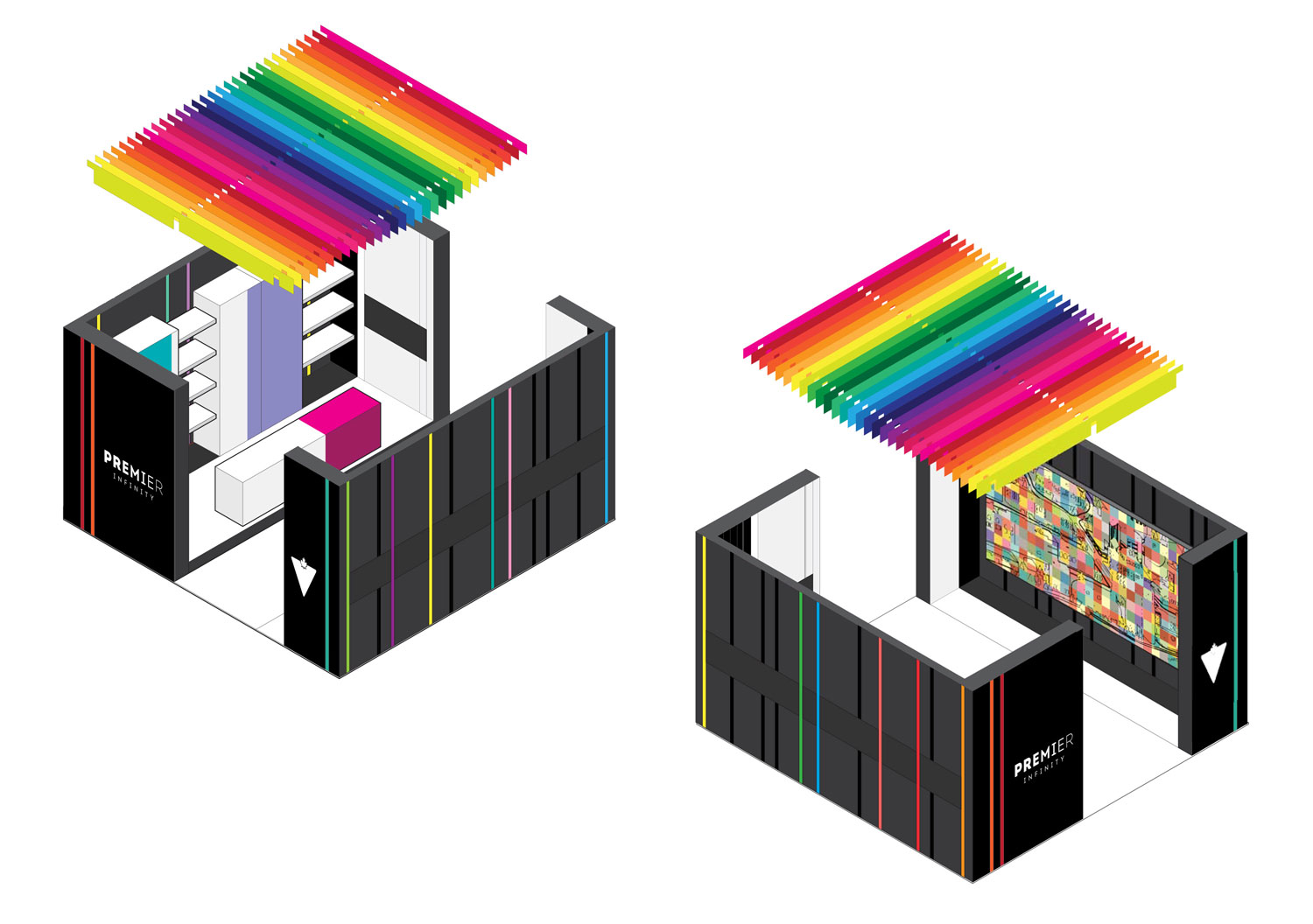
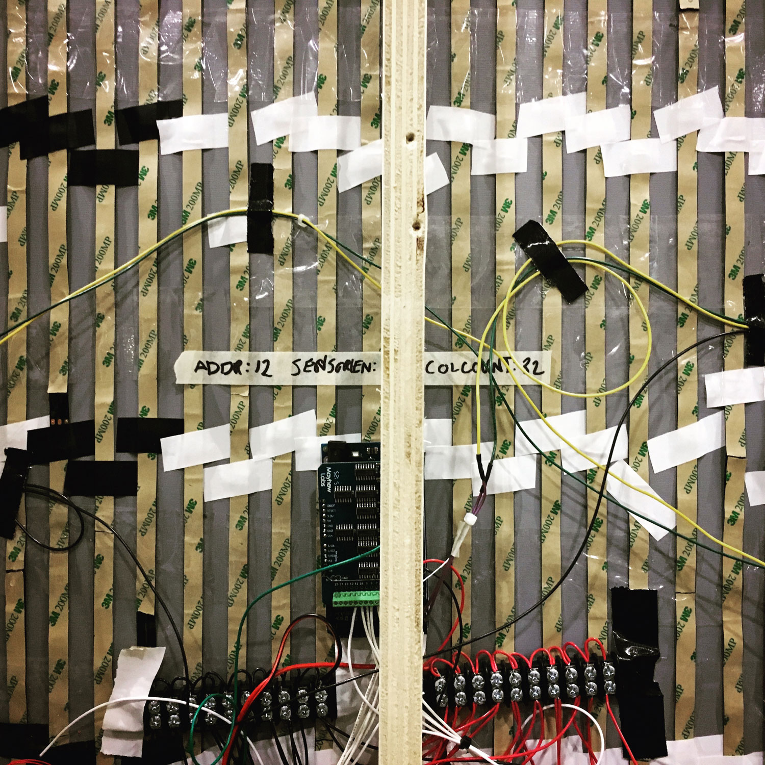
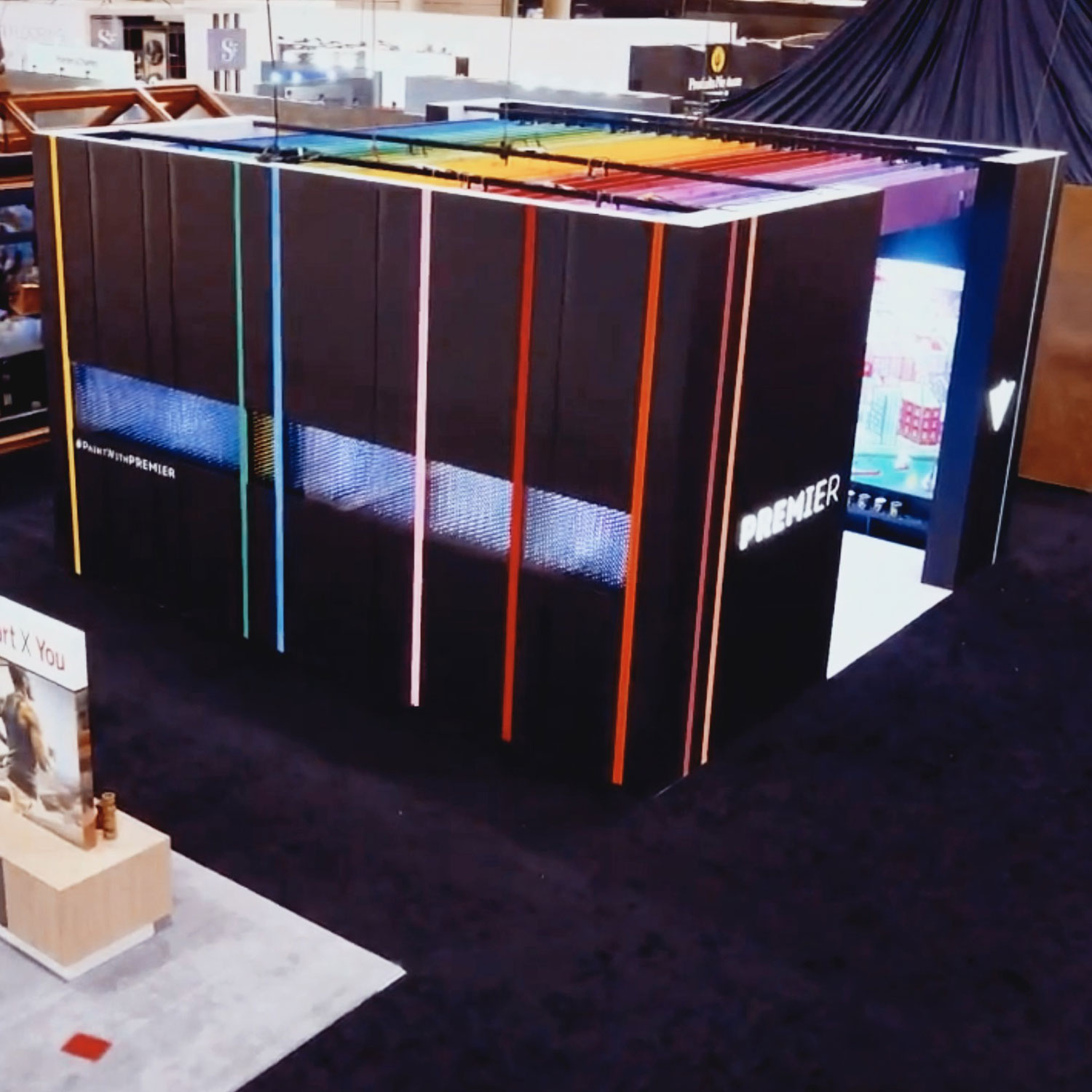
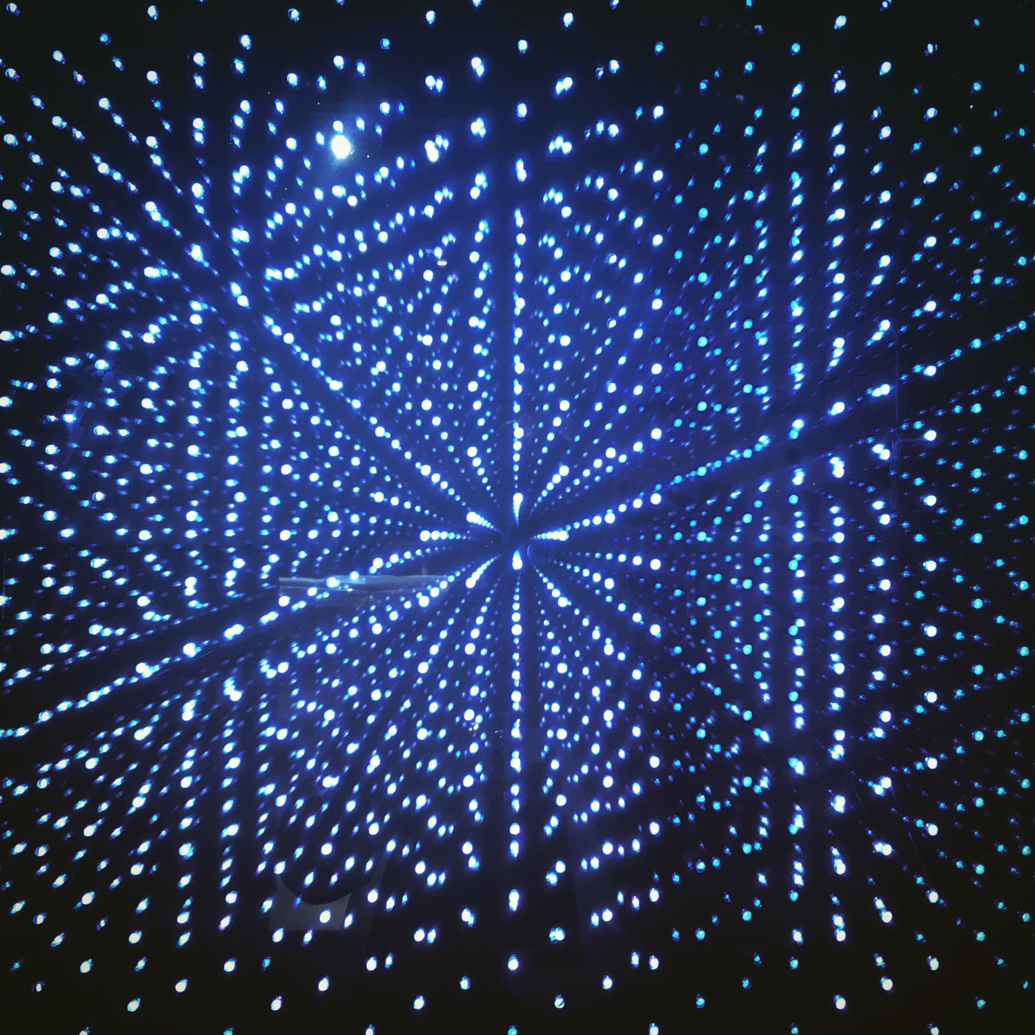
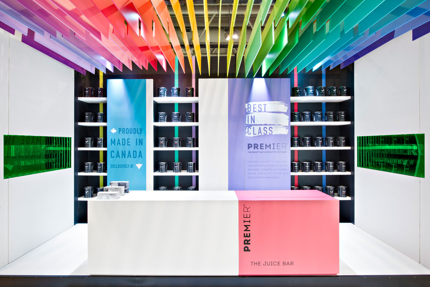
We designed a dramatic “black box” that referenced the product packaging and created an air of mystery. On the outside, a band of motion-activated LED infinity mirrors allowed visitors to illuminate stripes of vibrant colour as they passed by. Generous openings at each end of the “box” offered captivating glimpses of the bold colours within.
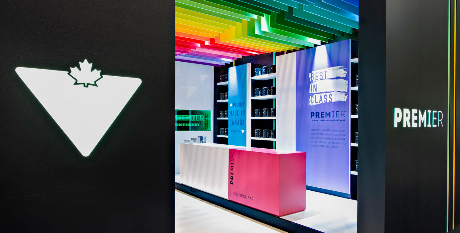
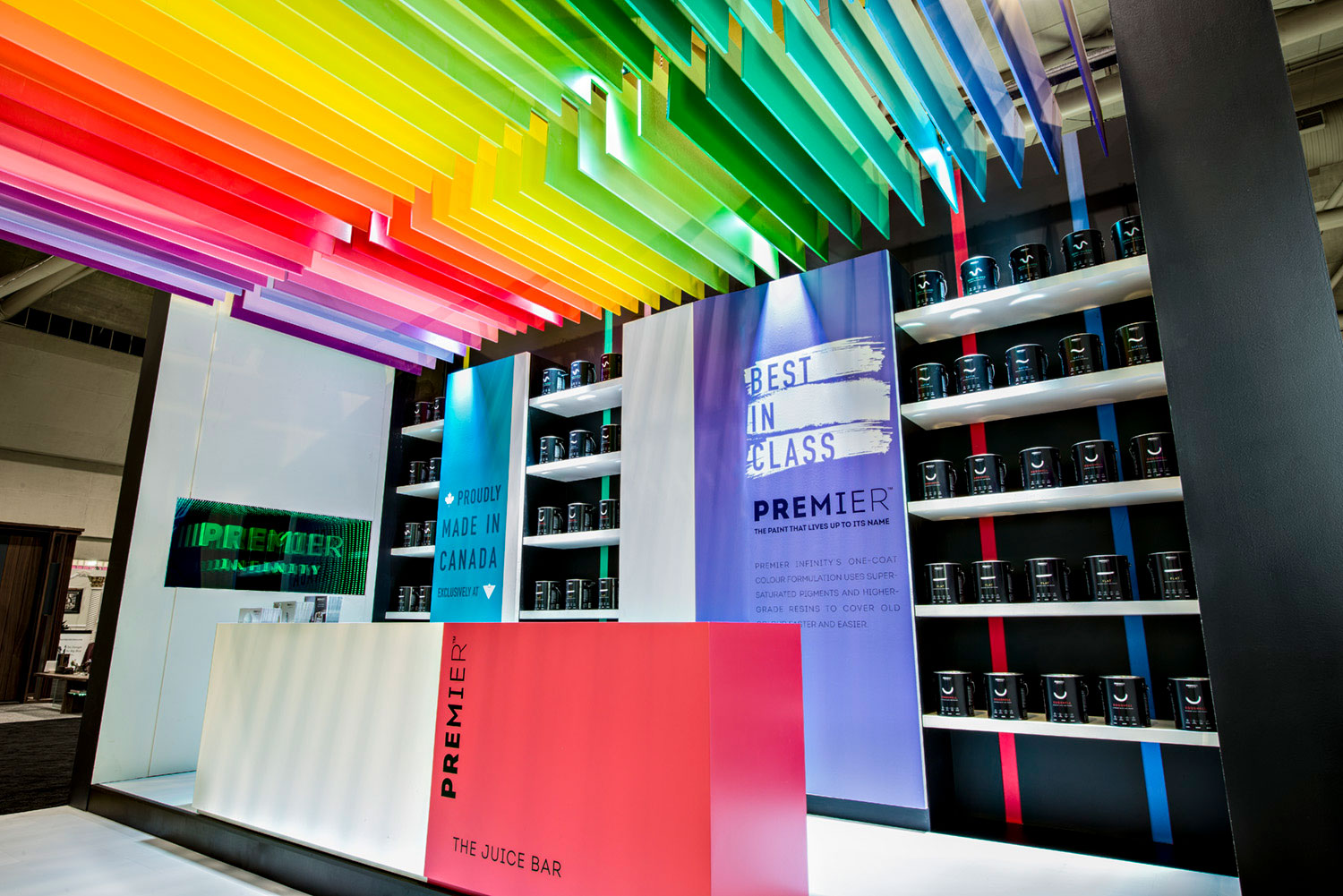
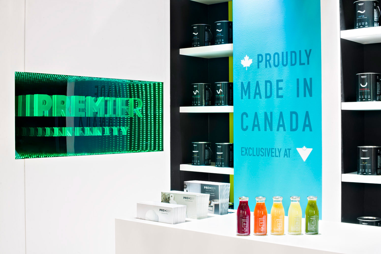
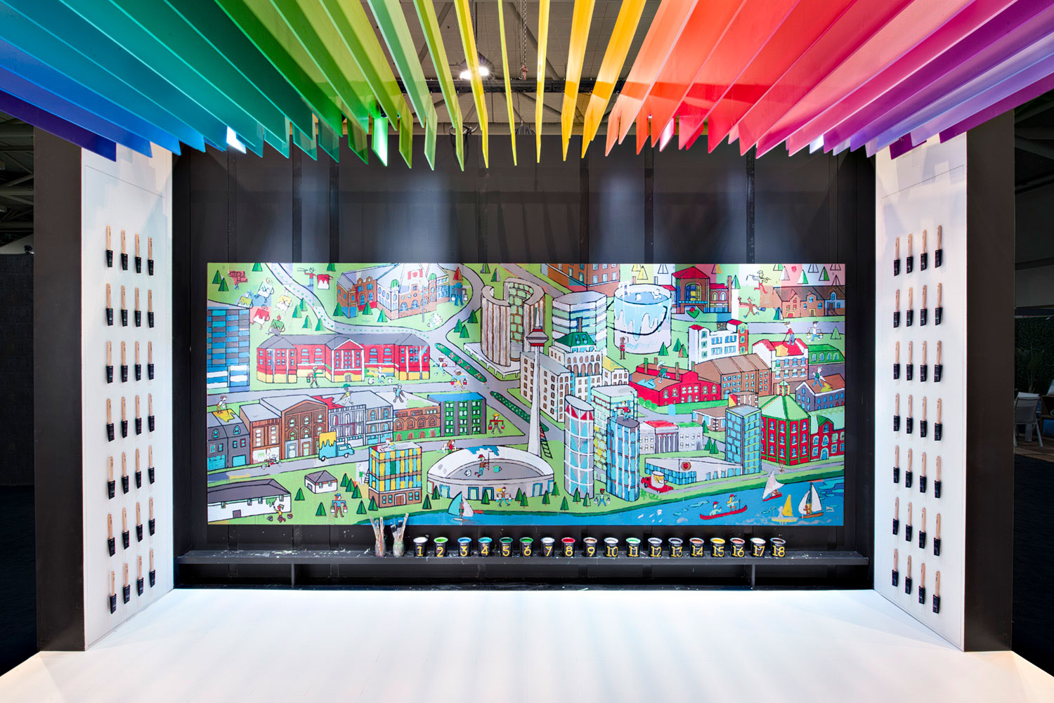
Once inside, the real magic began. Visitors were invited to unleash their inner artist and engage with the product by participating in a massive paint-by-number mural of the Toronto cityscape. Guests were able to experience the superb one-coat coverage of the product for themselves in a fun and immersive way. A complimentary juice bar featuring Greenhouse hand-pressed juices, colour matched to paint chips and named accordingly, was an added attraction that further encouraged visitors to linger and learn about the Premier Infinity brand.
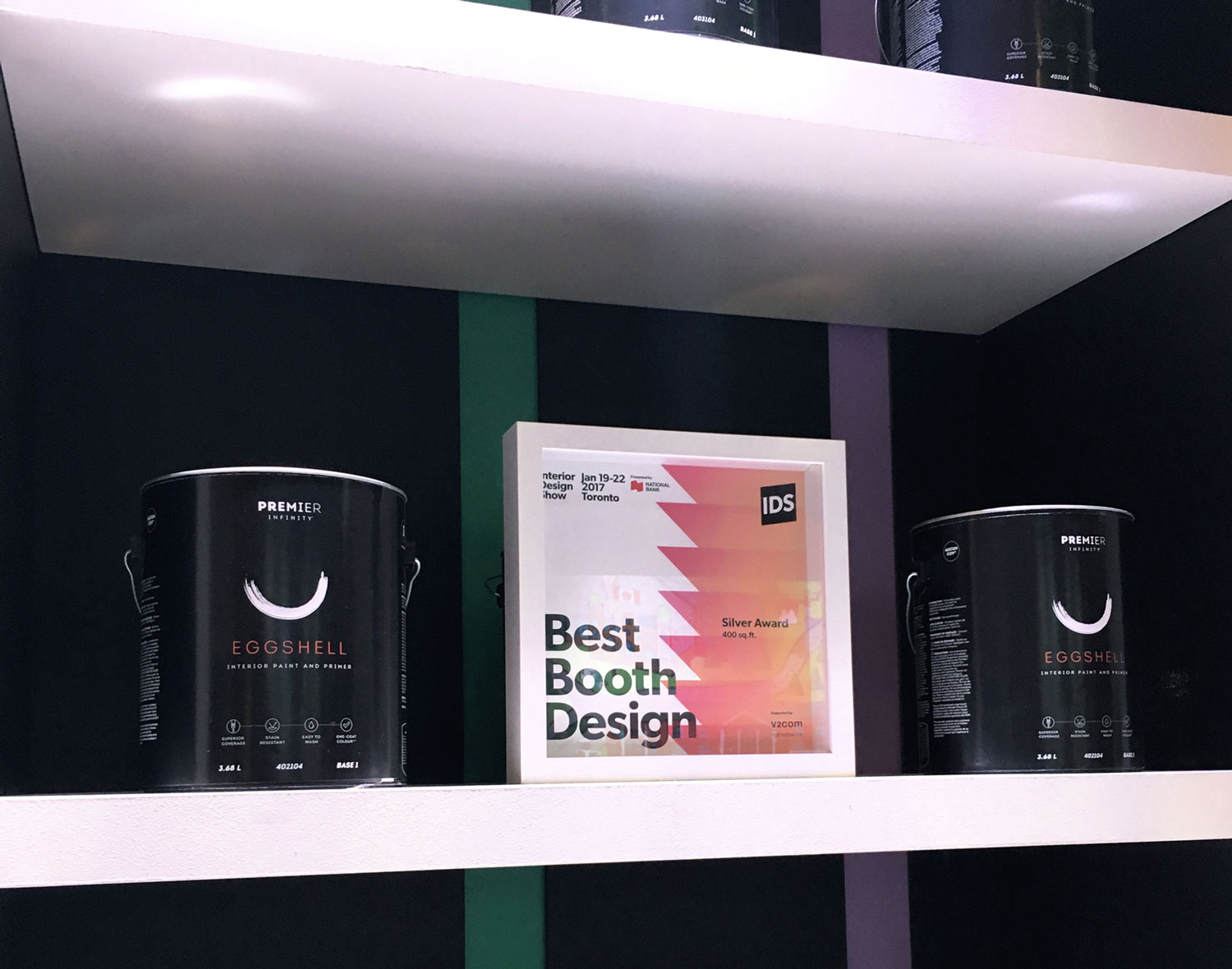
In the end, our space was a massive success. The booth drew a near-constant flow of traffic and the interactive mural was extremely well received by all. Our client was thrilled with the excitement that was generated by the space and at how well their brand and product were showcased. Feedback was overwhelmingly positive and the "Locomotive Red" (Premier PR16G04) cherry on top was the Best Booth Award our clients were able to share with their colleagues back at the office on Monday morning.
In the end, our space was a massive success. The booth drew a near-constant flow of traffic and the interactive mural was extremely well received by all. Our client was thrilled with the excitement that was generated by the space and at how well their brand and product were showcased. Feedback was overwhelmingly positive and the "Locomotive Red" (Premier PR16G04) cherry on top was the Best Booth Award our clients were able to share with their colleagues back at the office on Monday morning.
In the end, our space was a massive success. The booth drew a near-constant flow of traffic and the interactive mural was extremely well received by all. Our client was thrilled with the excitement that was generated by the space and at how well their brand and product were showcased. Feedback was overwhelmingly positive and the "Locomotive Red" (Premier PR16G04) cherry on top was the Best Booth Award our clients were able to share with their colleagues back at the office on Monday morning.
In the end, our space was a massive success. The booth drew a near-constant flow of traffic and the interactive mural was extremely well received by all. Our client was thrilled with the excitement that was generated by the space and at how well their brand and product were showcased. Feedback was overwhelmingly positive and the "Locomotive Red" (Premier PR16G04) cherry on top was the Best Booth Award our clients were able to share with their colleagues back at the office on Monday morning.
In the end, our space was a massive success. The booth drew a near-constant flow of traffic and the interactive mural was extremely well received by all. Our client was thrilled with the excitement that was generated by the space and at how well their brand and product were showcased. Feedback was overwhelmingly positive and the "Locomotive Red" (Premier PR16G04) cherry on top was the Best Booth Award our clients were able to share with their colleagues back at the office on Monday morning.
" The way that CITIZENS AND COLLABORATORS thought of all the details — from the branded juice bottles to the social media-worthy interactive installation — made every touchpoint of the booth reflective of the brand, and helped show PREMIER and Canadian Tire in a new way. "
" The way that CITIZENS AND COLLABORATORS thought of all the details — from the branded juice bottles to the social media-worthy interactive installation — made every touchpoint of the booth reflective of the brand, and helped show PREMIER and Canadian Tire in a new way. "
" The way that CITIZENS AND COLLABORATORS thought of all the details — from the branded juice bottles to the social media-worthy interactive installation — made every touchpoint of the booth reflective of the brand, and helped show PREMIER and Canadian Tire in a new way. "
Tracy Platt, AVP Product Development, Style & Home
Canadian Tire Corporation
Tracy Platt, AVP Product Development, Style & Home
Canadian Tire Corporation
1238 Queen St. East | Unit H | Toronto | ON | M4L 1C3 | 647 344 1144 Email Us
1238 Queen St E | Unit H | Toronto | ON | M4L 1C3 | 647 344 1144 Email Us
1238 Queen St E | Unit H | Toronto | ON | M4L 1C3 | 647 344 1144 Email Us
1238 Queen St E | Unit H | Toronto | ON | M4L 1C3 | 647 344 1144 Email Us
