Ikea Ticket Centre
Ikea Ticket Centre
Ikea Ticket Centre
Ikea Ticket Centre
Ikea Ticket Centre
Design: Space | Graphics | Video
Design: Space | Graphics | Video
Design: Space | Graphics | Video
Design: Space | Graphics | Video
Design: Space | Graphics | Video
As one of the lead sponsors of the Interior Design Show (IDS) from 2011 - 2014, IKEA Canada hosted the Show's ticket centres. They came to us to create the annual re-design, which melded the retailer's on-brand elements & current trends with the overall IDS visual theme for the year.
As one of the lead sponsors of the Interior Design Show (IDS) from 2011 - 2014, IKEA Canada hosted the Show's ticket centres. They came to us to create the annual re-design, which melded the retailer's on-brand elements & current trends with the overall IDS visual theme for the year.
As one of the lead sponsors of the Interior Design Show (IDS) from 2011 - 2014, IKEA Canada hosted the Show's ticket centres. They came to us to create the annual re-design, which melded the retailer's on-brand elements & current trends with the overall IDS visual theme for the year.
As one of the lead sponsors of the Interior Design Show (IDS) from 2011 - 2014, IKEA Canada hosted the Show's ticket centres. They came to us to create the annual re-design, which melded the retailer's on-brand elements & current trends with the overall IDS visual theme for the year.
As one of the lead sponsors of the Interior Design Show (IDS) from 2011 - 2014, IKEA Canada hosted the Show's ticket centres. They came to us to create the annual re-design, which melded the retailer's on-brand elements & current trends with the overall IDS visual theme for the year.
IDS11
IDS11
In 2011, our design coordinated with a large-scale digital tower installation we also created for the Show. As the tower was located in the area adjacent to the ticket centres, carrying over the look and implementing technology created a complementary and cohesive overall design to the main floor area.
In 2011, our design coordinated with a large-scale digital tower installation we also created for the Show. As the tower was located in the area adjacent to the ticket centres, carrying over the look and implementing technology created a complementary and cohesive overall design to the main floor area.
In 2011, our design coordinated with a large-scale digital tower installation we also created for the Show. As the tower was located in the area adjacent to the ticket centres, carrying over the look and implementing technology created a complementary and cohesive overall design to the main floor area.
In 2011, our design coordinated with a large-scale digital tower installation we also created for the Show. As the tower was located in the area adjacent to the ticket centres, carrying over the look and implementing technology created a complementary and cohesive overall design to the main floor area.
In 2011, our design coordinated with a large-scale digital tower installation we also created for the Show. As the tower was located in the area adjacent to the ticket centres, carrying over the look and implementing technology created a complementary and cohesive overall design to the main floor area.
IDS12
IDS12
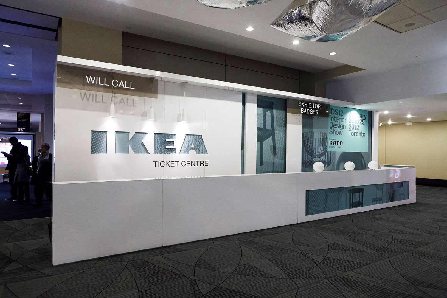
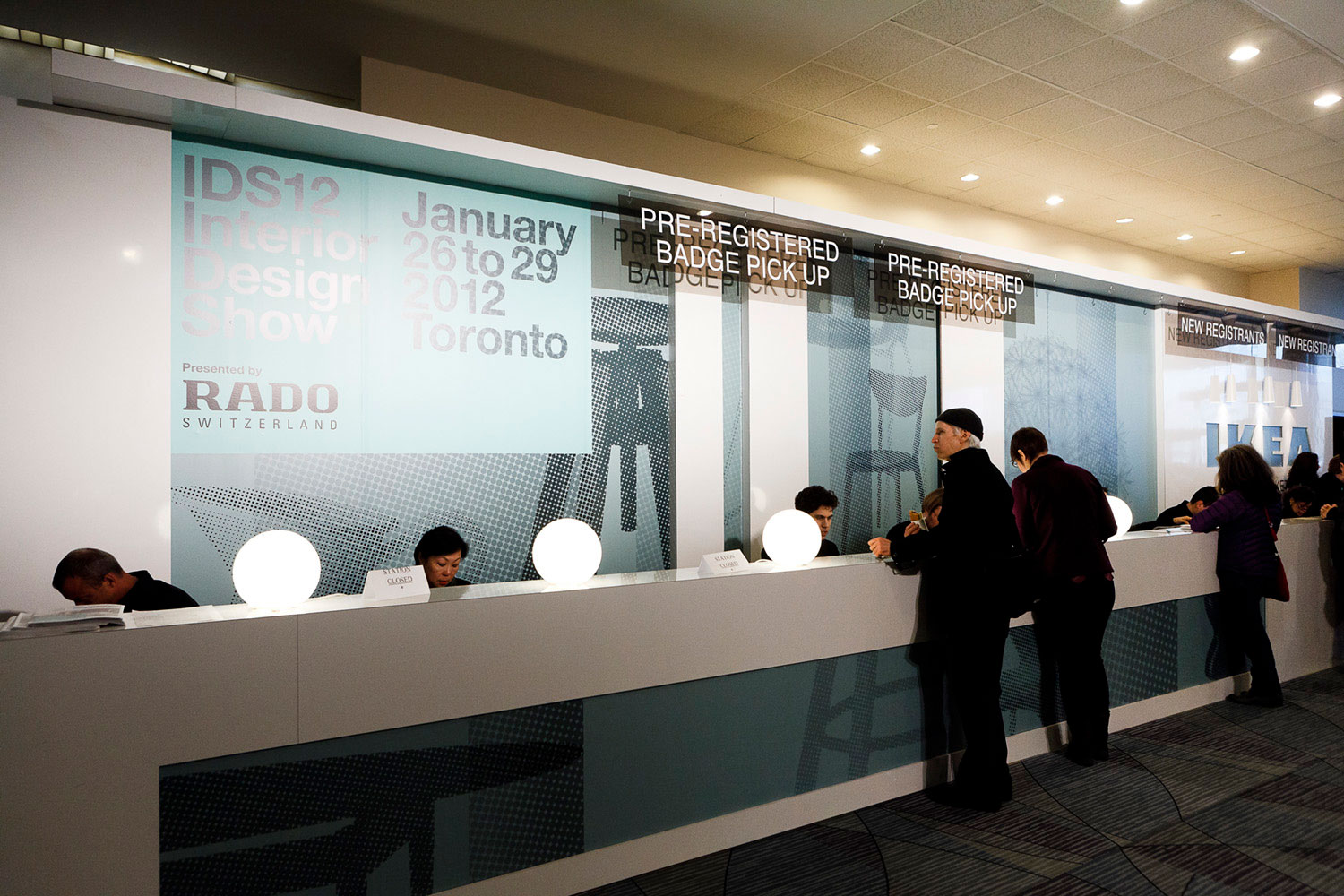
In 2012, we retained the same architecture as the previous year but used a static pattern as the backdrop. We incorporated IDS' colour palette and featured silhouettes of key pieces from IKEA's newest collection.
In 2012, we retained the same architecture as the previous year but used a static pattern as the backdrop. We incorporated IDS' colour palette and featured silhouettes of key pieces from IKEA's newest collection.
In 2012, we retained the same architecture as the previous year but used a static pattern as the backdrop. We incorporated IDS' colour palette and featured silhouettes of key pieces from IKEA's newest collection.
In 2012, we retained the same architecture as the previous year but used a static pattern as the backdrop. We incorporated IDS' colour palette and featured silhouettes of key pieces from IKEA's newest collection.
In 2012, we retained the same architecture as the previous year but used a static pattern as the backdrop. We incorporated IDS' colour palette and featured silhouettes of key pieces from IKEA's newest collection.
IDS13
IDS13
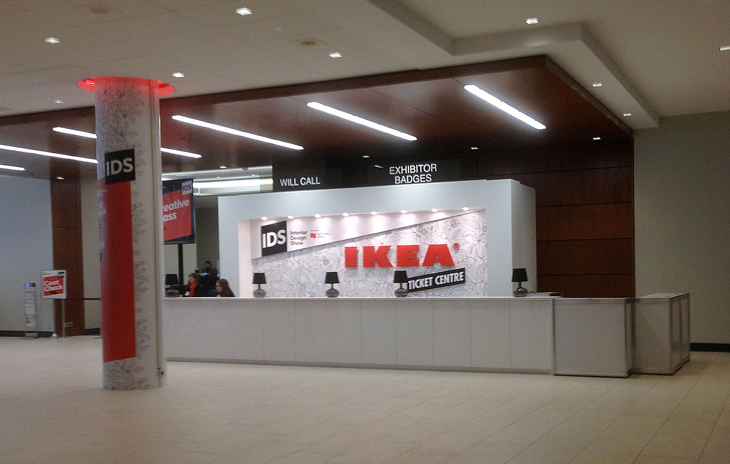
In 2013, we updated the booth's architecture with 3D elements for a new look that would carry through to future shows. The background graphic was an overscaled pattern from one of IKEA's trendy textiles, which worked well with the vibrant red that was part of the IDS branding for that year.
In 2013, we updated the booth's architecture with 3D elements for a new look that would carry through to future shows. The background graphic was an overscaled pattern from one of IKEA's trendy textiles, which worked well with the vibrant red that was part of the IDS branding for that year.
In 2013, we updated the booth's architecture with 3D elements for a new look that would carry through to future shows. The background graphic was an overscaled pattern from one of IKEA's trendy textiles, which worked well with the vibrant red that was part of the IDS branding for that year.
In 2013, we updated the booth's architecture with 3D elements for a new look that would carry through to future shows. The background graphic was an overscaled pattern from one of IKEA's trendy textiles, which worked well with the vibrant red that was part of the IDS branding for that year.
In 2013, we updated the booth's architecture with 3D elements for a new look that would carry through to future shows. The background graphic was an overscaled pattern from one of IKEA's trendy textiles, which worked well with the vibrant red that was part of the IDS branding for that year.
IDS14
IDS14
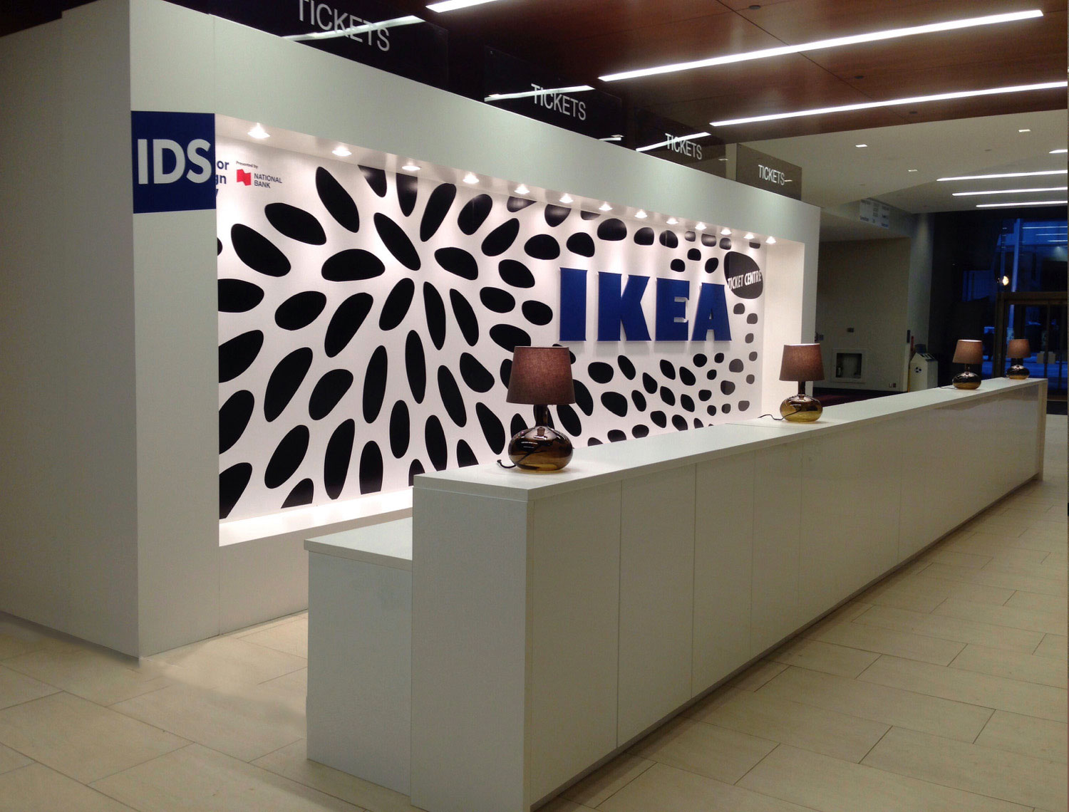
To give 2014's ticket centre a visually textured and vibrant look while also retaining a distinctly IKEA feel, we once again utilized one of their own popular textiles. We adapted the black and white design, overscaled the pattern and incorporated IDS' indigo blue into the signage.
To give 2014's ticket centre a visually textured and vibrant look while also retaining a distinctly IKEA feel, we once again utilized one of their own popular textiles. We adapted the black and white design, overscaled the pattern and incorporated IDS' indigo blue into the signage.
To give 2014's ticket centre a visually textured and vibrant look while also retaining a distinctly IKEA feel, we once again utilized one of their own popular textiles. We adapted the black and white design, overscaled the pattern and incorporated IDS' indigo blue into the signage.
To give 2014's ticket centre a visually textured and vibrant look while also retaining a distinctly IKEA feel, we once again utilized one of their own popular textiles. We adapted the black and white design, overscaled the pattern and incorporated IDS' indigo blue into the signage.
To give 2014's ticket centre a visually textured and vibrant look while also retaining a distinctly IKEA feel, we once again utilized one of their own popular textiles. We adapted the black and white design, overscaled the pattern and incorporated IDS' indigo blue into the signage.
1238 Queen St. East | Unit H | Toronto | ON | M4L 1C3 | 647 344 1144 Email Us
1238 Queen St E | Unit H | Toronto | ON | M4L 1C3 | 647 344 1144 Email Us
1238 Queen St E | Unit H | Toronto | ON | M4L 1C3 | 647 344 1144 Email Us
1238 Queen St E | Unit H | Toronto | ON | M4L 1C3 | 647 344 1144 Email Us


