neat | Queen St West
neat | Queen St West
neat | Queen St West
neat | Queen St West
Design: Space | Branding | Graphics | Digital
Design: Space | Branding | Graphics | Digital
Design: Space | Branding | Graphics | Digital
Design: Space | Branding | Graphics | Digital
Design: Space | Branding | Graphics | Digital
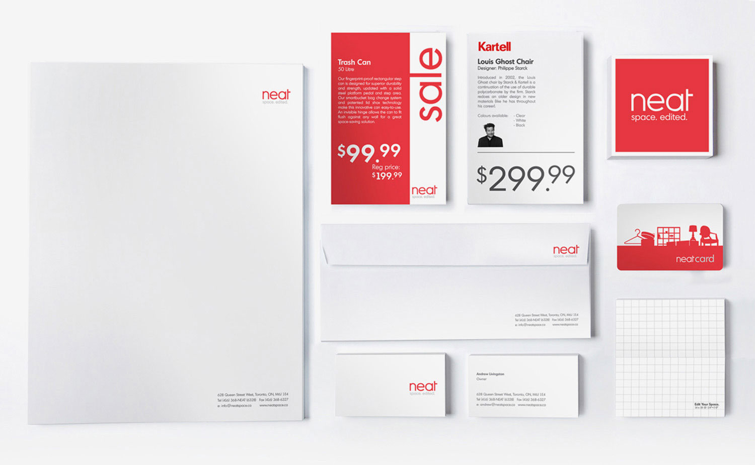
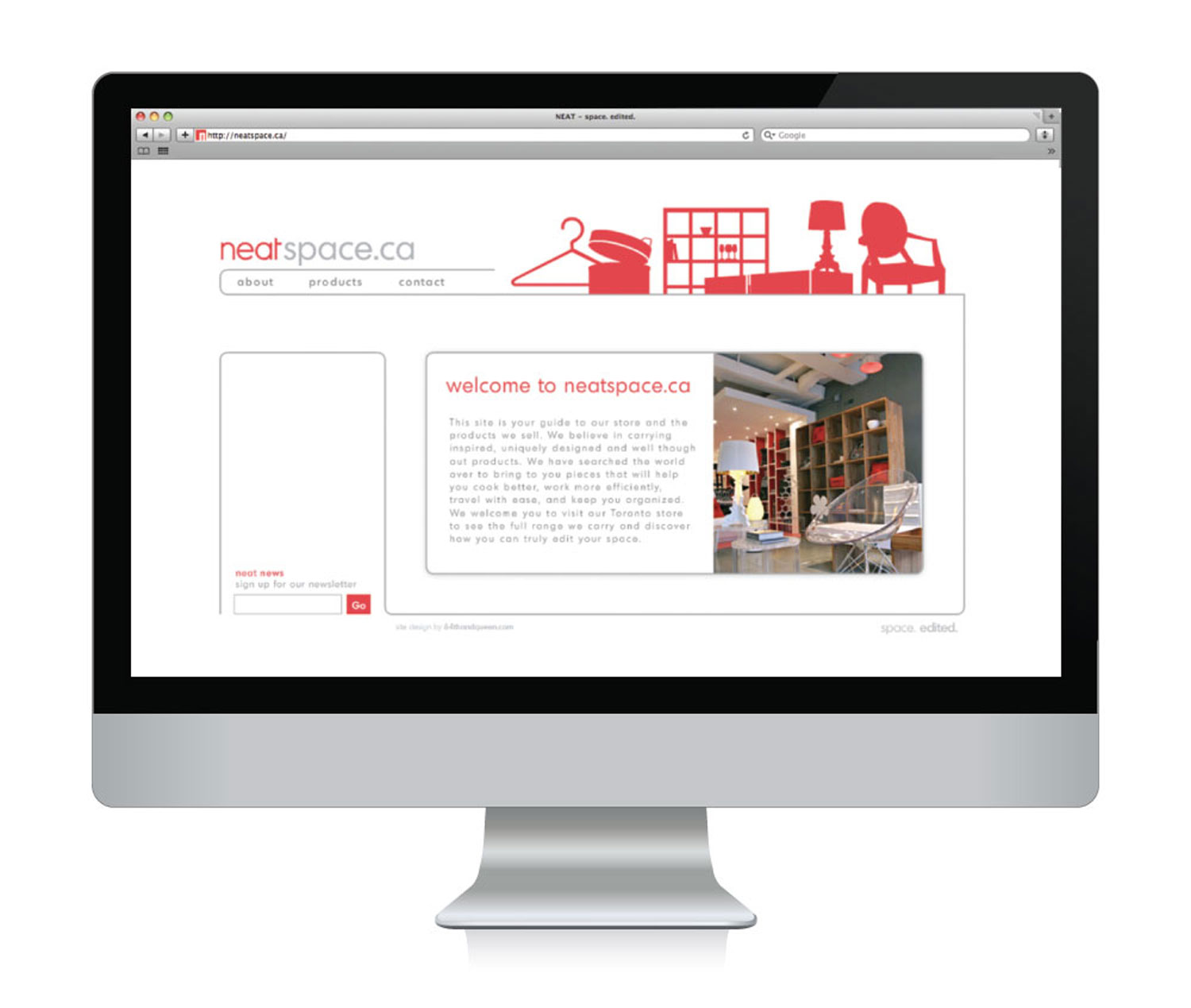
When neat, a retailer specializing in modern, design-forward space-saving home essentials, decided to move from their Yorkville location to the heart of the Queen West shopping district, we were brought in to design the interior space and revamp the branding and graphics.
When neat, a retailer specializing in modern, design-forward space-saving home essentials, decided to move from their Yorkville location to the heart of the Queen West shopping district, we were brought in to design the interior space and revamp the branding and graphics.
When neat, a retailer specializing in modern, design-forward space-saving home essentials, decided to move from their Yorkville location to the heart of the Queen West shopping district, we were brought in to design the interior space and revamp the branding and graphics.
When neat, a retailer specializing in modern, design-forward space-saving home essentials, decided to move from their Yorkville location to the heart of the Queen West shopping district, we were brought in to design the interior space and revamp the branding and graphics.
When neat, a retailer specializing in modern, design-forward space-saving home essentials, decided to move from their Yorkville location to the heart of the Queen West shopping district, we were brought in to design the interior space and revamp the branding and graphics.
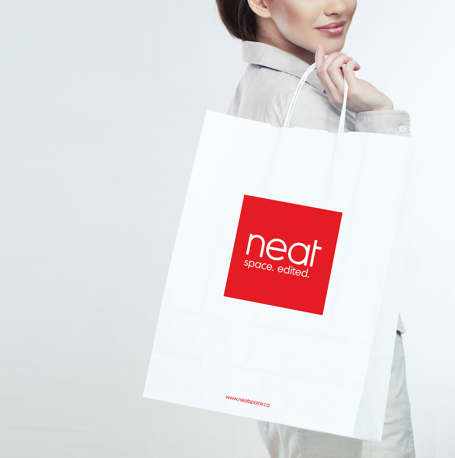
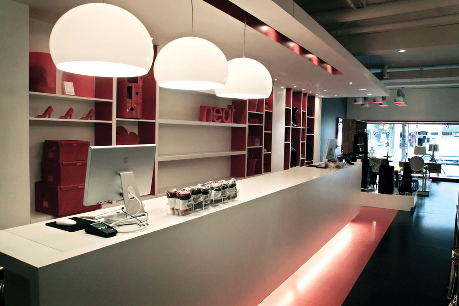
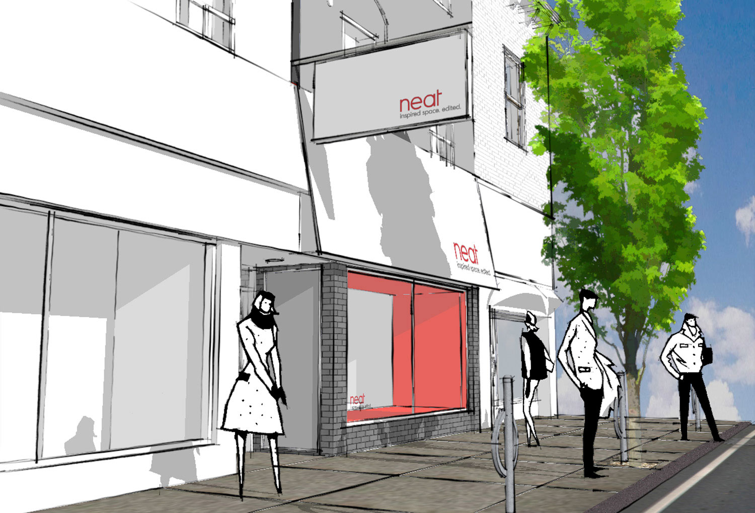
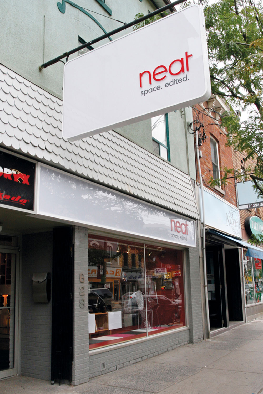
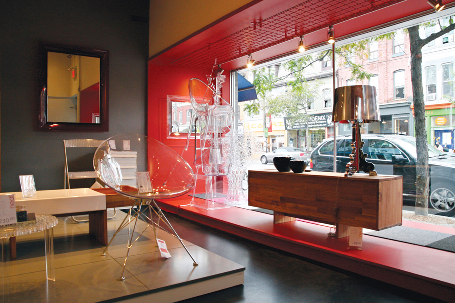
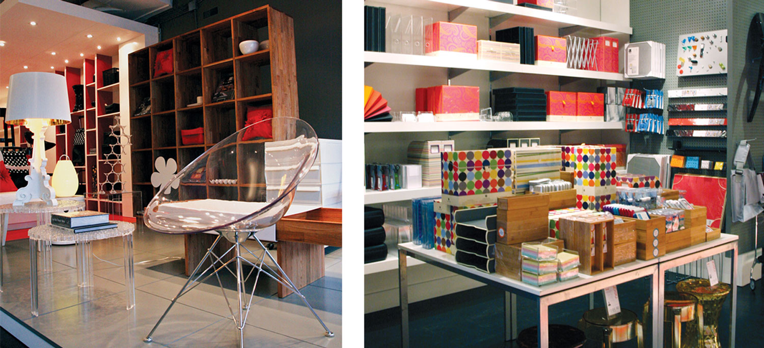
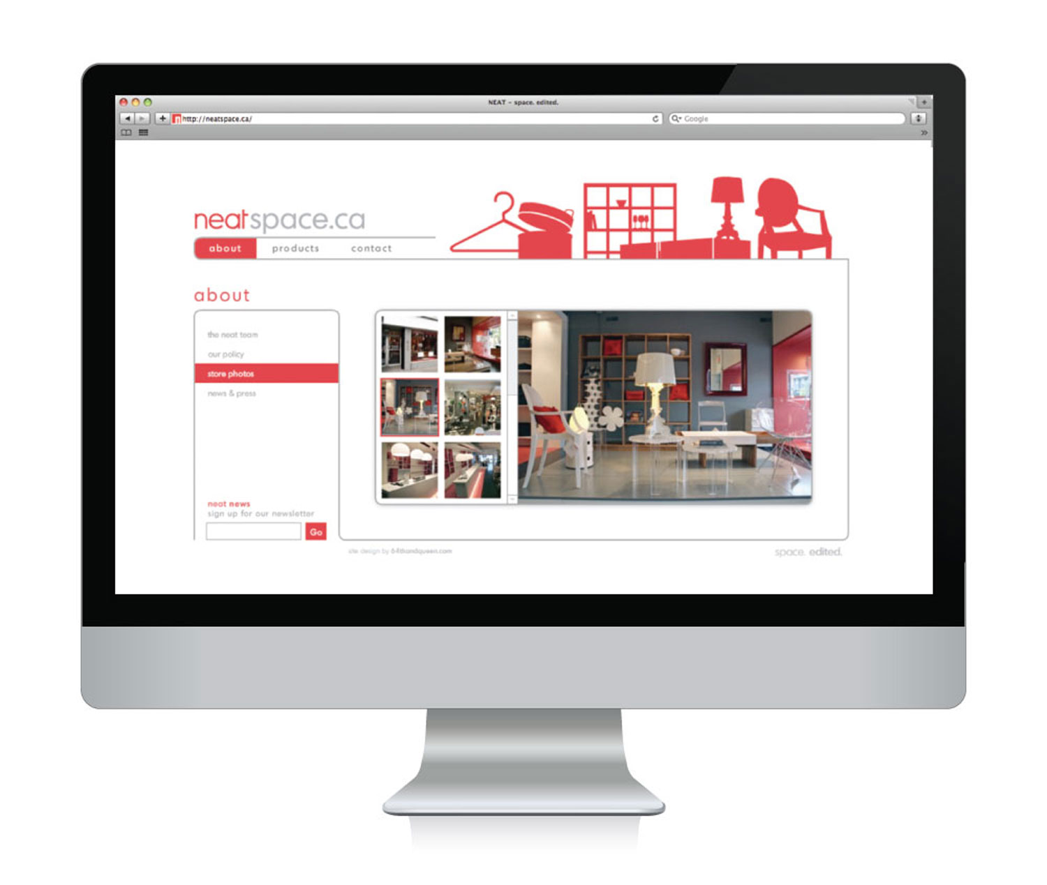
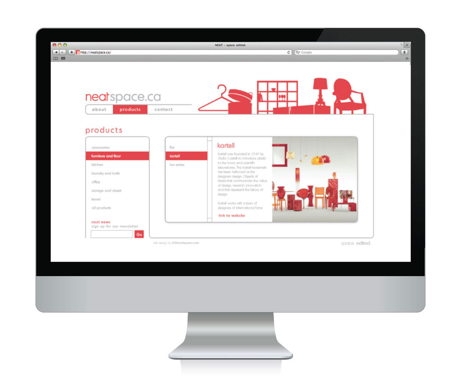
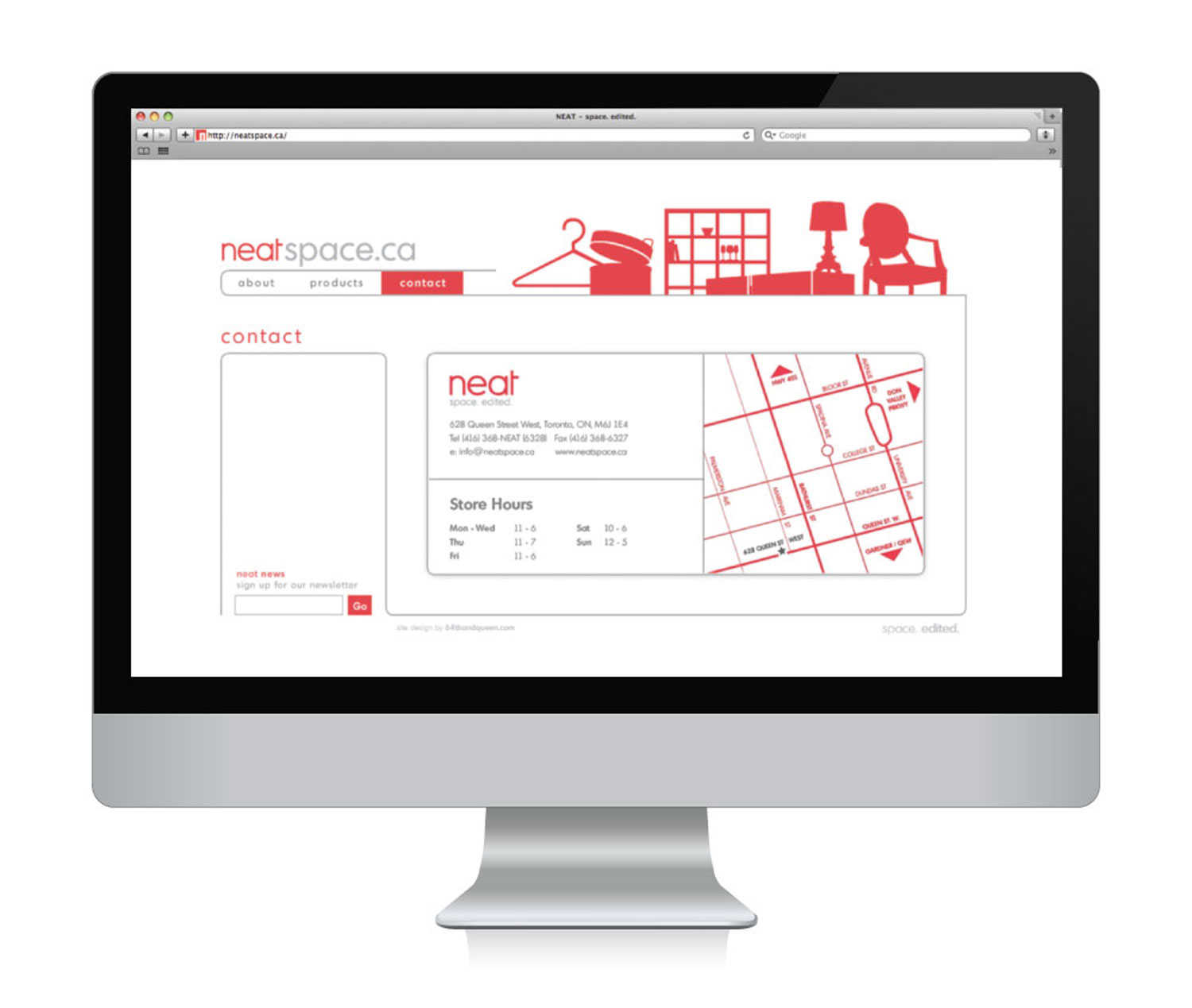
One of the first changes we made was to revise the name from Neat Storage Solutions to the simpler neat, which we felt to be both intriguing and a perfect descriptor of the, well, neat items they carried. For the space itself we went with a bolder, more urban and inviting look to suit the neighbourhood. The red that was already an established colour for the brand was taken to a brighter hue and we decided to implement the red and white palette in a bigger, more striking way. Inside, the colours were used to dramatic effect with simple, bold fixtures and details.
One of the first changes we made was to revise the name from Neat Storage Solutions to the simpler neat, which we felt to be both intriguing and a perfect descriptor of the, well, neat items they carried. For the space itself, we went with a bolder, more urban and inviting look to suit the neighbourhood. The red that was already an established colour for the brand was taken to a brighter hue and we decided to implement the red and white palette in a bigger, more striking way. Inside, the colours were used to dramatic effect with simple, bold fixtures and details.
One of the first changes we made was to revise the name from Neat Storage Solutions to the simpler neat, which we felt to be both intriguing and a perfect descriptor of the, well, neat items they carried. For the space itself, we went with a bolder, more urban and inviting look to suit the neighbourhood. The red that was already an established colour for the brand was taken to a brighter hue and we decided to implement the red and white palette in a bigger, more striking way. Inside, the colours were used to dramatic effect with simple, bold fixtures and details.
One of the first changes we made was to revise the name from Neat Storage Solutions to the simpler neat, which we felt to be both intriguing and a perfect descriptor of the, well, neat items they carried. For the space itself, we went with a bolder, more urban and inviting look to suit the neighbourhood. The red that was already an established colour for the brand was taken to a brighter hue and we decided to implement the red and white palette in a bigger, more striking way. Inside, the colours were used to dramatic effect with simple, bold fixtures and details.
One of the first changes we made was to revise the name from Neat Storage Solutions to the simpler neat, which we felt to be both intriguing and a perfect descriptor of the, well, neat items they carried. For the space itself, we went with a bolder, more urban and inviting look to suit the neighbourhood. The red that was already an established colour for the brand was taken to a brighter hue and we decided to implement the red and white palette in a bigger, more striking way. Inside, the colours were used to dramatic effect with simple, bold fixtures and details.
1238 Queen St. East | Unit H | Toronto | ON | M4L 1C3 | 647 344 1144 Email Us
1238 Queen St E | Unit H | Toronto | ON | M4L 1C3 | 647 344 1144 Email Us
1238 Queen St E | Unit H | Toronto | ON | M4L 1C3 | 647 344 1144 Email Us
1238 Queen St E | Unit H | Toronto | ON | M4L 1C3 | 647 344 1144 Email Us
