
The Bay
Queen St flagship
The Bay
Queen St flagship
The Bay
Queen St flagship
The Bay
Queen St flagship
The Bay
Queen St flagship
Design: Space | Experiential | Graphics
Design: Space | Experiential | Graphics
Design: Space | Experiential | Graphics
Design: Space | Experiential | Graphics
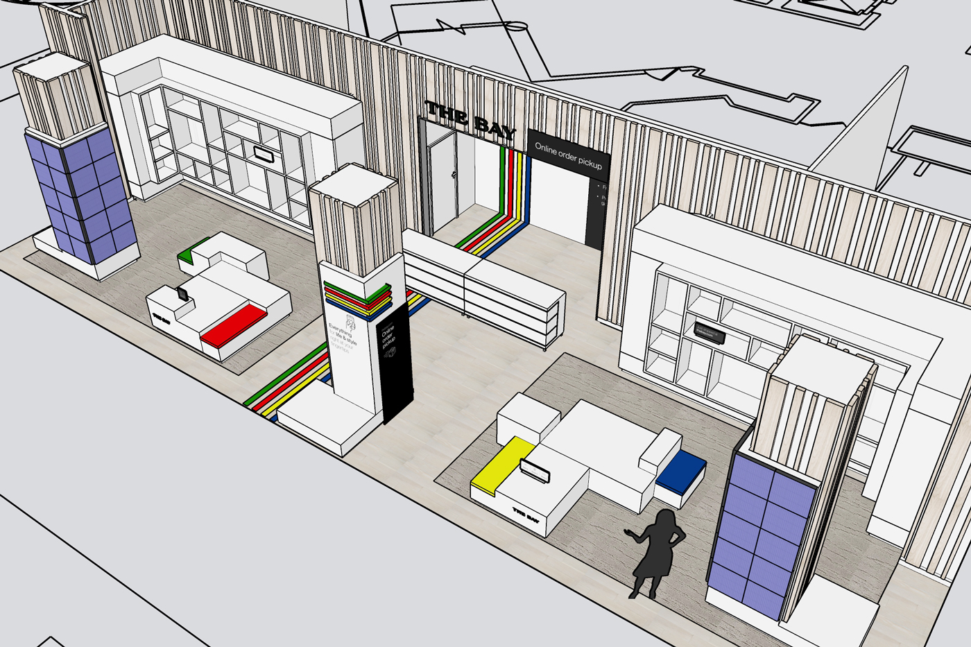
Based on the positive response and success of the Stackt Market space we created for The Bay, they asked us extend their concept for TheBay.com to their Queen Street flagship. Replacing a significant portion of their handbags department on the main floor, the space was transformed into a hub for their online marketplace—a place to pick up online orders and be inspired by a curation of select products sold on their website.
Based on the positive response and success of the Stackt Market space we created for The Bay, they asked us extend their concept for TheBay.com to their Queen Street flagship. Replacing a significant portion of their handbags department on the main floor, the space was transformed into a hub for their online marketplace—a place to pick up online orders and be inspired by a curation of select products sold on their website.
Based on the positive response and success of the Stackt Market space we created for The Bay, they asked us extend their concept for TheBay.com to their Queen Street flagship. Replacing a significant portion of their handbags department on the main floor, the space was transformed into a hub for their online marketplace—a place to pick up online orders and be inspired by a curation of select products sold on their website.
Based on the positive response and success of the Stackt Market space we created for The Bay, they asked us extend their concept for TheBay.com to their Queen Street flagship. Replacing a significant portion of their handbags department on the main floor, the space was transformed into a hub for their online marketplace—a place to pick up online orders and be inspired by a curation of select products sold on their website.
Based on the positive response and success of the Stackt Market space we created for The Bay, they asked us extend their concept for TheBay.com to their Queen Street flagship. Replacing a significant portion of their handbags department on the main floor, the space was transformed into a hub for their online marketplace—a place to pick up online orders and be inspired by a curation of select products sold on their website.
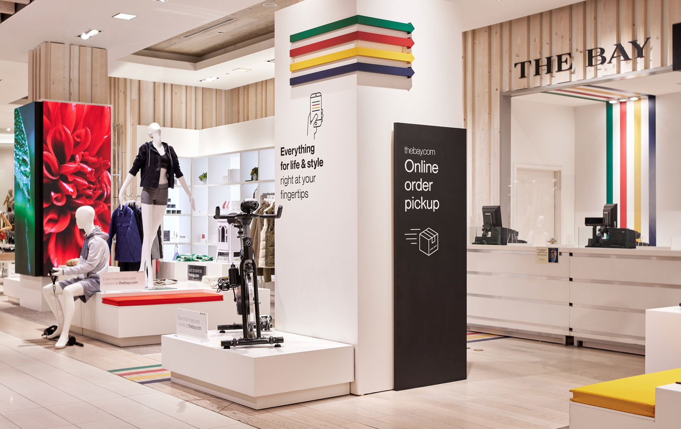
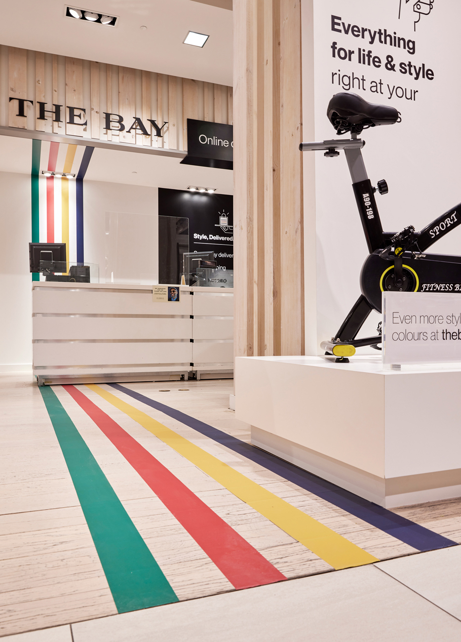
The mandate was simple—to create a high-impact space, that stood apart from the rest of the store, yet built with as little disruption to the exising department as possible. The space needed to be simple, flexible and effectively communicate TheBay.com's endless product assortment.
The mandate was simple—to create a high-impact space, that stood apart from the rest of the store, yet built with as little disruption to the exising department as possible. The space needed to be simple, flexible and effectively communicate TheBay.com's endless product assortment.
The mandate was simple—to create a high-impact space, that stood apart from the rest of the store, yet built with as little disruption to the exising department as possible. The space needed to be simple, flexible and effectively communicate TheBay.com's endless product assortment.
The mandate was simple—to create a high-impact space, that stood apart from the rest of the store, yet built with as little disruption to the exising department as possible. The space needed to be simple, flexible and effectively communicate TheBay.com's endless product assortment.
The mandate was simple—to create a high-impact space, that stood apart from the rest of the store, yet built with as little disruption to the exising department as possible. The space needed to be simple, flexible and effectively communicate TheBay.com's endless product assortment.
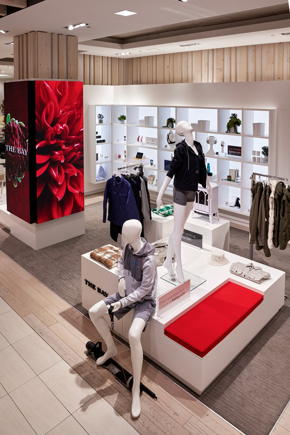
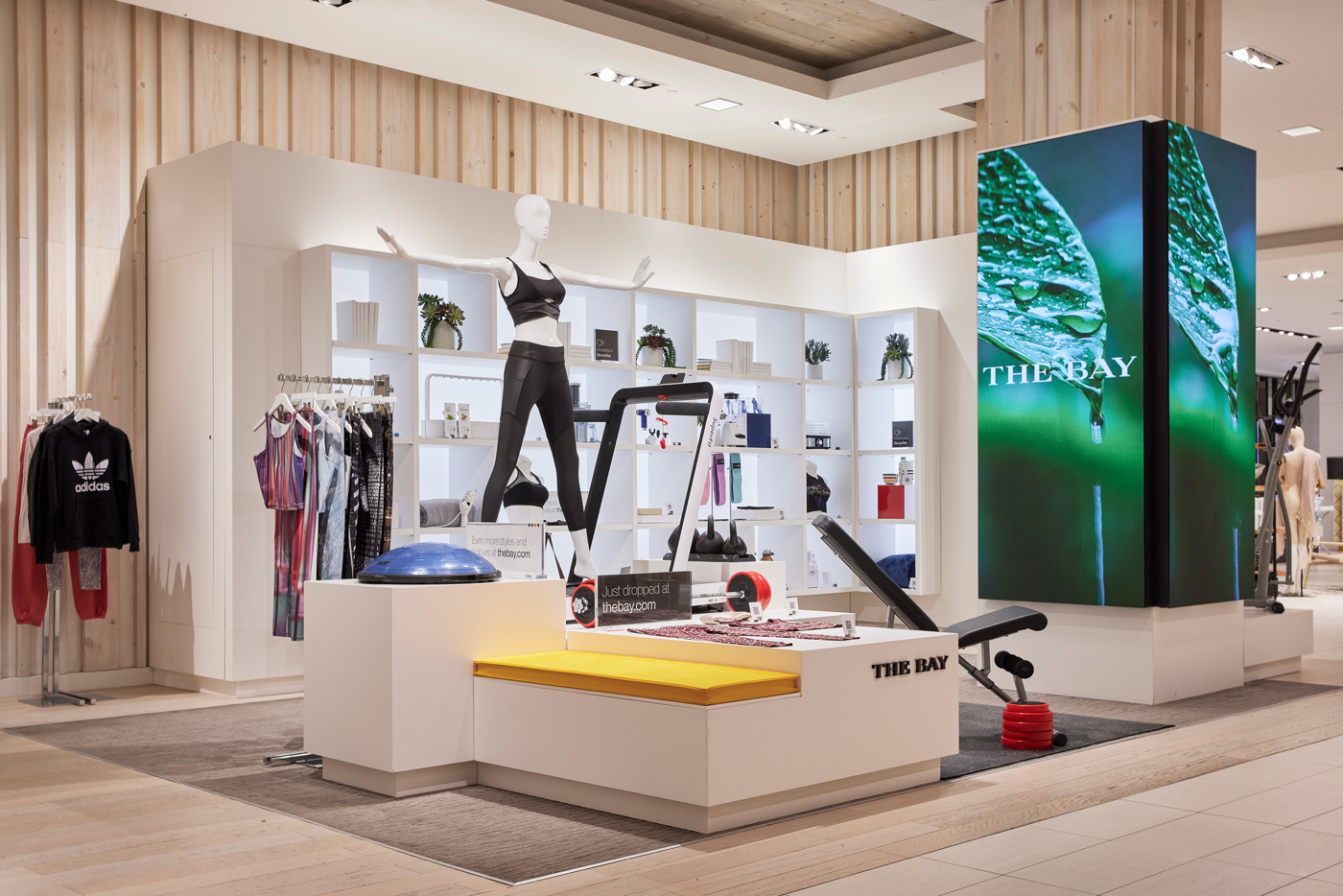
Part of the experience was to weave in tech elements, including digital screens to support the brand message, campaigns and releases. Product was given a digital look and feel within a backlit wall display, while larger pieces were set up on mondrian-inspired, multi-tiered risers with integrated seating.
Part of the experience was to weave in tech elements, including digital screens to support the brand message, campaigns and releases. Product was given a digital look and feel within a backlit wall display, while larger pieces were set up on mondrian-inspired, multi-tiered risers with integrated seating.
Part of the experience was to weave in tech elements, including digital screens to support the brand message, campaigns and releases. Product was given a digital look and feel within a backlit wall display, while larger pieces were set up on mondrian-inspired, multi-tiered risers with integrated seating.
Part of the experience was to weave in tech elements, including digital screens to support the brand message, campaigns and releases. Product was given a digital look and feel within a backlit wall display, while larger pieces were set up on mondrian-inspired, multi-tiered risers with integrated seating.
To draw attention from the outside, a multi-width video tile installation was created inside the existing shipping container space, displaying a simple animation of the classic HBC stripes, in random passing movement from end to end. The intention was to bring the stripes to life in a striking, yet subtle way, all while maintaining visibility into the shop.
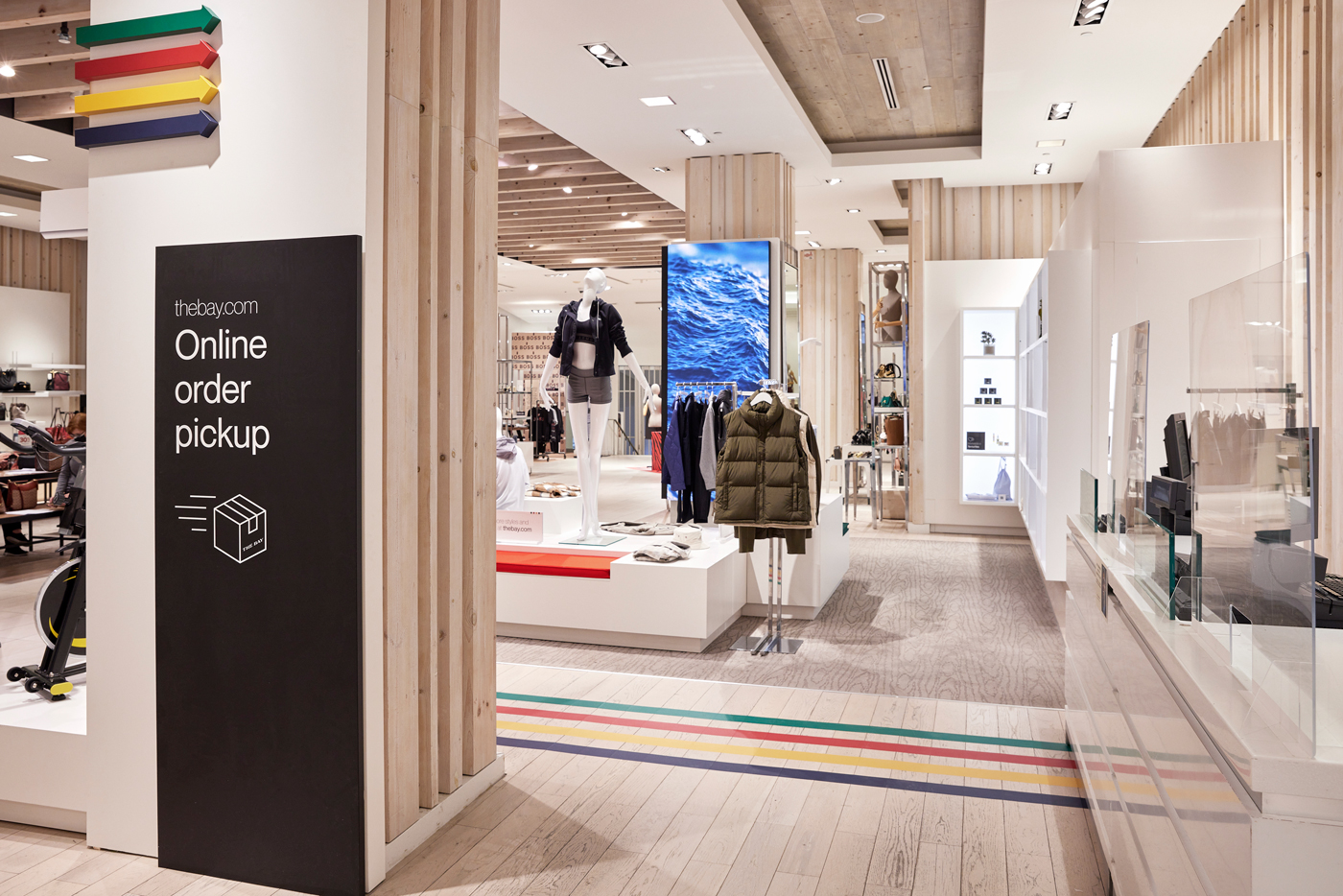
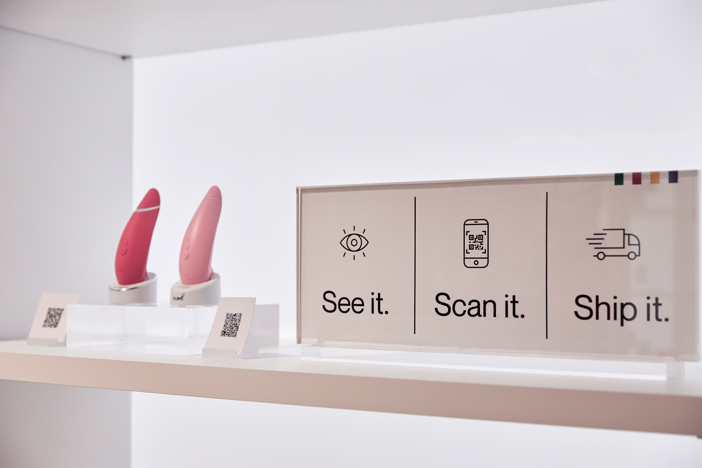

Signage and graphics custom created by us were minimalist with an appropriate use of simple icons to carry an effective message. A bold use of the HBC stripes were positioned to draw attention to the space. QR codes were deployed to bring shoppers back to the website, generating attention to the online marketplace and driving sales.
Signage and graphics custom created by us were minimalist with an appropriate use of simple icons to carry an effective message. A bold use of the HBC stripes were positioned to draw attention to the space. QR codes were deployed to bring shoppers back to the website, generating attention to the online marketplace and driving sales.
Signage and graphics custom created by us were minimalist with an appropriate use of simple icons to carry an effective message. A bold use of the HBC stripes were positioned to draw attention to the space. QR codes were deployed to bring shoppers back to the website, generating attention to the online marketplace and driving sales.
Signage and graphics custom created by us were minimalist with an appropriate use of simple icons to carry an effective message. A bold use of the HBC stripes were positioned to draw attention to the space. QR codes were deployed to bring shoppers back to the website, generating attention to the online marketplace and driving sales.
Signage and graphics custom created by us were minimalist with an appropriate use of simple icons to carry an effective message. A bold use of the HBC stripes were positioned to draw attention to the space. QR codes were deployed to bring shoppers back to the website, generating attention to the online marketplace and driving sales.
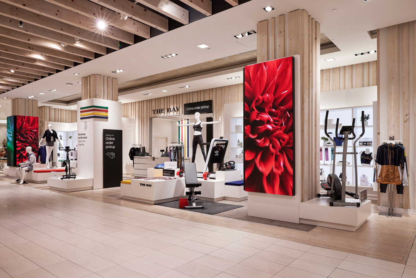
In all, TheBay.com's in-store marketplace design was a perfect backdrop to display a vaste array of product possiblities. The space was designed to be bright, simple and elegant with enough room to pause and take it all in.
In all, TheBay.com's in-store marketplace design was a perfect backdrop to display a vaste array of product possiblities. The space was designed to be bright, simple and elegant with enough room to pause and take it all in.
In all, TheBay.com's in-store marketplace design was a perfect backdrop to display a vaste array of product possiblities. The space was designed to be bright, simple and elegant with enough room to pause and take it all in.
In all, TheBay.com's in-store marketplace design was a perfect backdrop to display a vaste array of product possiblities. The space was designed to be bright, simple and elegant with enough room to pause and take it all in.
In all, TheBay.com's in-store marketplace design was a perfect backdrop to display a vaste array of product possiblities. The space was designed to be bright, simple and elegant with enough room to pause and take it all in.