Union31 - U31
Union31 - U31
Union31 - U31
Union31 - U31
Union31 - U31
Design: Branding | Graphics | Digital
Design: Branding | Graphics | Digital
Design: Branding | Graphics | Digital
Design: Branding | Graphics | Digital
Design: Branding | Graphics | Digital
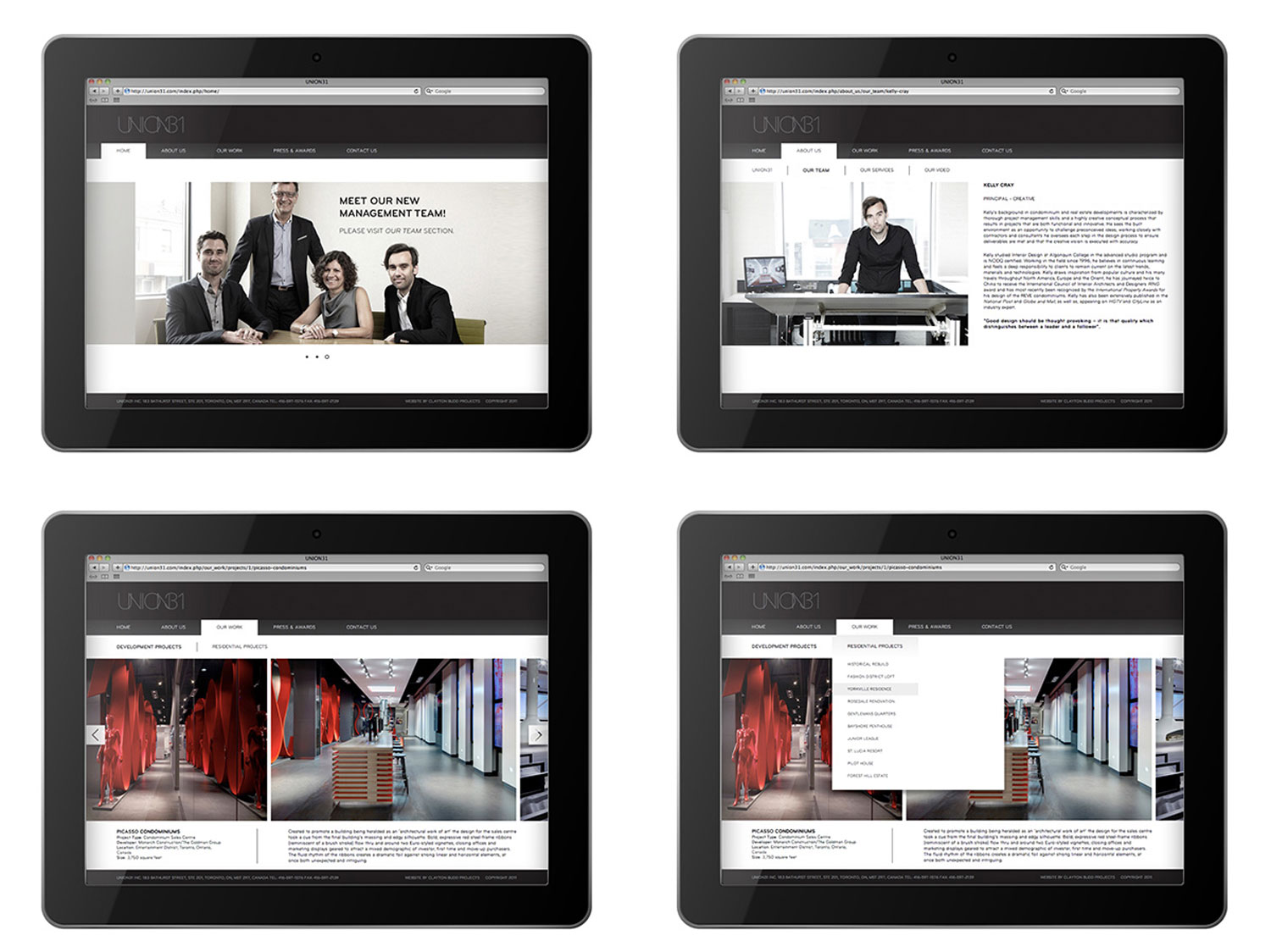
When established Toronto design company Chapman Design Group became UNION31, they approached us to help develop their name and create the new brand from the ground up. The goal was to achieve an elevated look reflective of their clientele and their style of work in residential and condo sales centre design – upscale, luxurious and contemporary.
When established Toronto design company Chapman Design Group became UNION31, they approached us to help develop their name and create the new brand from the ground up. The goal was to achieve an elevated look reflective of their clientele and their style of work in residential and condo sales centre design – upscale, luxurious and contemporary.
When established Toronto design company Chapman Design Group became UNION31, they approached us to help develop their name and create the new brand from the ground up. The goal was to achieve an elevated look reflective of their clientele and their style of work in residential and condo sales centre design – upscale, luxurious and contemporary.
When established Toronto design company Chapman Design Group became UNION31, they approached us to help develop their name and create the new brand from the ground up. The goal was to achieve an elevated look reflective of their clientele and their style of work in residential and condo sales centre design – upscale, luxurious and contemporary.
When established Toronto design company Chapman Design Group became UNION31, they approached us to help develop their name and create the new brand from the ground up. The goal was to achieve an elevated look reflective of their clientele and their style of work in residential and condo sales centre design – upscale, luxurious and contemporary.
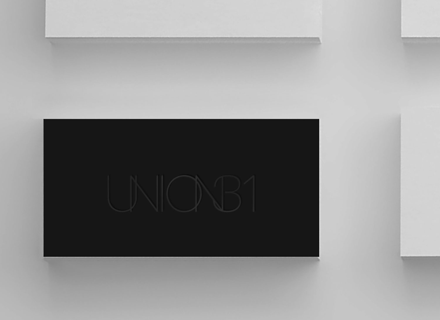
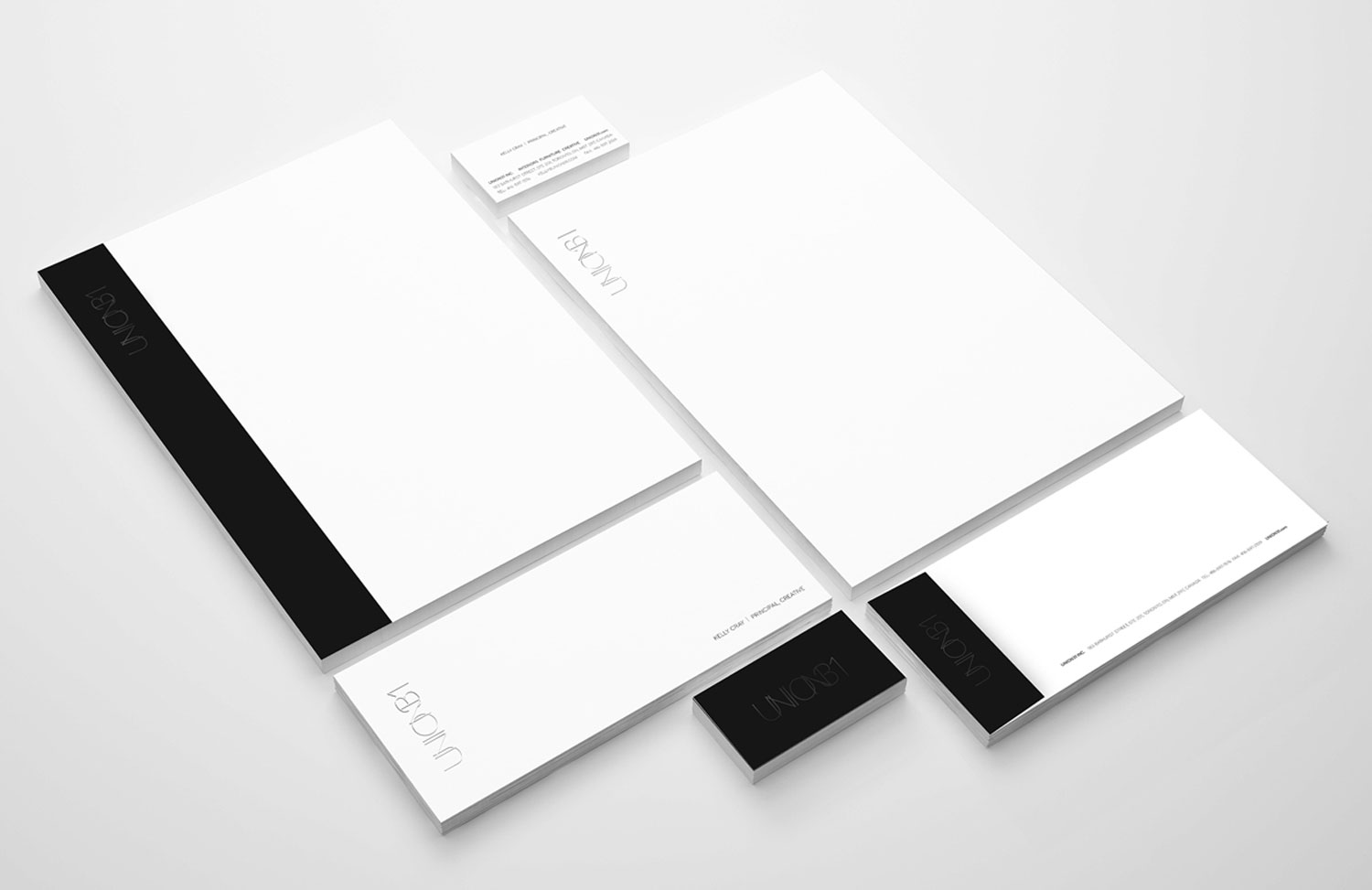
We wanted to create something timeless, sleek & sophisticated. Accessible yet aspirational in tone. We opted for a classic black & white palette and custom simple sans serif font for the logo, featuring intersected typeface intended to give both a visual interpretation of the name and symbolize the coming together of a new partnership.
We wanted to create something timeless, sleek & sophisticated. Accessible yet aspirational in tone. We opted for a classic black & white palette and custom simple sans serif font for the logo, featuring intersected typeface intended to give both a visual interpretation of the name and symbolize the coming together of a new partnership.
We wanted to create something timeless, sleek & sophisticated. Accessible yet aspirational in tone. We opted for a classic black & white palette and custom simple sans serif font for the logo, featuring intersected typeface intended to give both a visual interpretation of the name and symbolize the coming together of a new partnership.
We wanted to create something timeless, sleek & sophisticated. Accessible yet aspirational in tone. We opted for a classic black & white palette and custom simple sans serif font for the logo, featuring intersected typeface intended to give both a visual interpretation of the name and symbolize the coming together of a new partnership.
We wanted to create something timeless, sleek & sophisticated. Accessible yet aspirational in tone. We opted for a classic black & white palette and custom simple sans serif font for the logo, featuring intersected typeface intended to give both a visual interpretation of the name and symbolize the coming together of a new partnership.
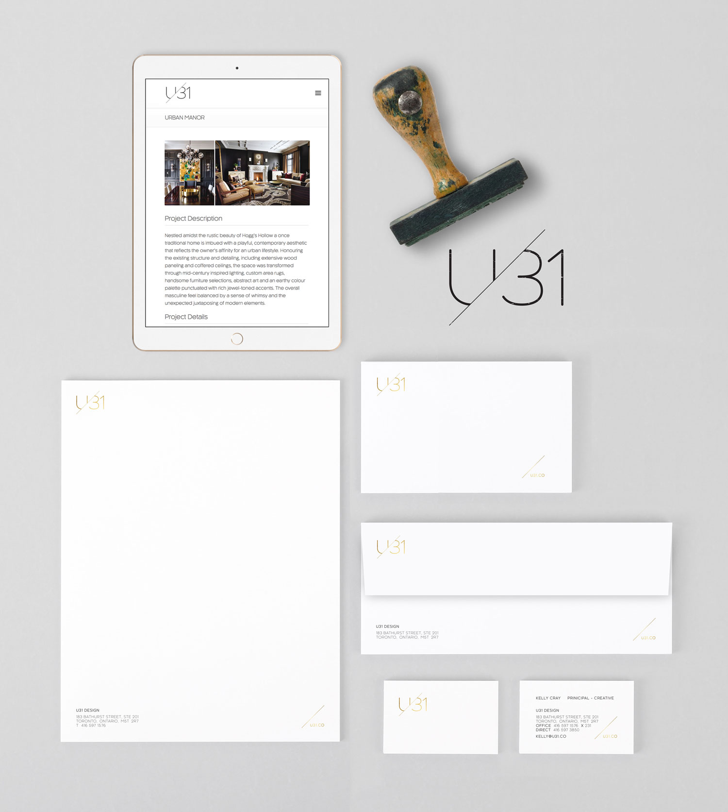
A few years later, when the company evolved into U31, we were again brought on board to modify and update the brand and graphics. We took a slightly more stylized approach with the new logo but kept it clean, timeless and modern. We also refreshed the palette with the addition of gold for a more contemporary feel.
A few years later, when the company evolved into U31, we were again brought on board to modify and update the brand and graphics. We took a slightly more stylized approach with the new logo but kept it clean, timeless and modern. We also refreshed the palette with the addition of gold for a more contemporary feel.
A few years later, when the company evolved into U31, we were again brought on board to modify and update the brand and graphics. We took a slightly more stylized approach with the new logo but kept it clean, timeless and modern. We also refreshed the palette with the addition of gold for a more contemporary feel.
A few years later, when the company evolved into U31, we were again brought on board to modify and update the brand and graphics. We took a slightly more stylized approach with the new logo but kept it clean, timeless and modern. We also refreshed the palette with the addition of gold for a more contemporary feel.
A few years later, when the company evolved into U31, we were again brought on board to modify and update the brand and graphics. We took a slightly more stylized approach with the new logo but kept it clean, timeless and modern. We also refreshed the palette with the addition of gold for a more contemporary feel.
1238 Queen St. East | Unit H | Toronto | ON | M4L 1C3 | 647 344 1144 Email Us
1238 Queen St E | Unit H | Toronto | ON | M4L 1C3 | 647 344 1144 Email Us
1238 Queen St E | Unit H | Toronto | ON | M4L 1C3 | 647 344 1144 Email Us
1238 Queen St E | Unit H | Toronto | ON | M4L 1C3 | 647 344 1144 Email Us


